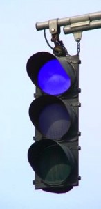
So…a couple of days ago I brought up the concerns we see around dashboards being used in a Canadian setting – senior executives putting the fear of god into managers who have a valid case for a red light on a project or initiative. As I noted then, dashboards are not a punishment – they are an information source. If you mangle your information sources for small-p political reasons, that’s not helpful.
There’s something else we need to talk about, at least in a Canadian context, eh?
We’re too nice.
No, really – we’re too nice. When I facilitate a collaborative stoplighting process, around IT investment planning or key project management, I need somewhat of a consensus around the room on the colour of any initiative. And I have to tell you, as Canadians, we are too nice.
Option one: those few things we are really aware of, Green; everything else – Yellow. Middle of the road. No reds. God bless us, but that’s the place we’re most comfortable. Yellow means I’ll decide later. And it’s amazing how much stuff gets turned yellow – out of honest ignorance, because someone doesn’t know the project well enough and so isn’t comfortable enough giving it a definite colour. Or out of Canadian kindness – we don’t want to tell our colleague we’re hitting the big “gong show” button on their project by calling it red.
Human nature. You can rail at it, or you can love it, and work with it. We do the latter. And it’s easy, actually.
Blue can be happy, peaceful, melancholy, rich…it’s a pretty impressive colour, with a lot of range. In our world, it goes just to the right of green.
Yep, we have a four-colour dashboard. Red / Yellow / Green / Blue. Impressive, eh? And we didn’t even have to pay extra for the extra colour. But that extra colour pays us dividends like crazy.
And it TOTALLY messes up our Canadian management teams. Cuz there’s no middle choice. And more often than you would imagine, someone says “Can we make it yellow-green…?” To which the non-directive, non-judgemental, always open, facilitative response is “No.” (Try working with us sometime – we’re fun that way.)
Blue.
It makes all the difference.
When we add in blue in an organization with a fear of red, there are still three choices on the plate. Yellow becomes the new red, and you still have differentiation between green and blue – green for the projects that are generally okay, and blue for the projects that are totally fine – running swimmingly – those ones that you just don’t need to concern yourself with.
Dashboards are incredible – well, they can be, if you can keep the analytical over-achievers from putting too much artificial synthesis on the top layer. Kept clean, focused on key outcomes, dashboards can be phenomenal tools to enable clarity, honest discussion, and focus.
If you live and work in a Canadian context (I can’t vouch for whether or not this cultural factoid is relevant in other countries), add a bit of blue to your executive dashboard today…you’ll appreciate the difference.
(For the analytics in the bunch, we could have a side-bar chat about the need for meta-analysis of the quantities of R/Y/G/B after the process is done. Is it actually possible to get a red? Is it actually possible to get a blue? Any limitation that brings the true answers down to only 2 or three colours is not helpful – it becomes a hidden limitation. But that’s another conversation. You have to buy me coffee for that one. 😉 )


