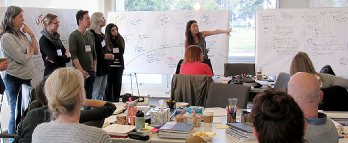
I recently mentioned some wonderful visual facilitation training that we took in at The Grove, in San Francisco. Well, we were hardly back and off the plane before I had the opportunity to put some of the training into practice. We were facilitating a two-day planning meeting for a client group, and it was imperative for each manager to “tell their story”, so that all attendees would have a richer understanding of what their peers were doing in service of the common goal.
An image seemed a natural way to convey this information in a common format, and very quickly, the restaurant analogy was born. It was playful and instantly understandable (although the kitchen door to the right representing the “resources” the waiter was drawing upon was not as obvious as I had hoped). Our plans to have a single poster reproduced by our regular printshop were scuttled, so on the morning of the first day, I was moving from sheet to sheet, drawing all six templates on 40″ x 72″ sheets of white paper. I made the first tentative sketches in a light yellow, and then moved from chart to chart a second time, going over the outline in black. A fascinating note – the charts are numbered in the order of creation, and you can see how the motions became more fluid as I got into a groove.
When the participants arrived, they were somewhat surprised to see all of the “cartoons” on the wall, in addition to the 12 Windows exercise we normally start with and the Principles that we normally have posted. However, when we got to the exercise and explained it, the six managers were quick to see the utility in the tool, and each filled out the template as met the particular concerns of their group. After 20 minutes filling out their individual templates, each manager “told the story” to the person next to them, as a way of firming up the content before the presentation to the broader group.
Much of the remainder of the first day was taken up in a template by template review of activities. The team moved around the room, some sitting, some standing, as met their needs. Each manager presented their work, and the assembled team worked together in a challenge function, ensuring that each key activity was in service of the overall strategic direction of the Branch. All agreed that the simple, unified template was highly useful.
We do a lot of work overnight on two day engagements, and this one was no different. Although the WhiteBoard Photo images don’t show it off very well, we pastelled each image overnight. The effect was quite pleasing; I am always amazed at how well pastels make images “pop”. The attendees as well seemed to appreciate the added colour; it added a bit of playfulness as well as some individuality and vibrancy to the room – always nice to have.
In the end, reduced for the final Book of Proceedings, these images look much more professional than I felt they did as full size images on the wall. Particularly as Visual Facilitation is a new addition to my toolset, I tended to see the weaknesses, and not the strengths of the individual templates. The images provide an impactful reminder of what was discussed and decided, and helps the attendees to tell the story to co-workers back in their home offices.
Will we do it again? Absolutely. Would I recommend the Grove Visual Facilitation training to anyone who was serious about adding to their facilitative toolkit? Again, absolutely.

